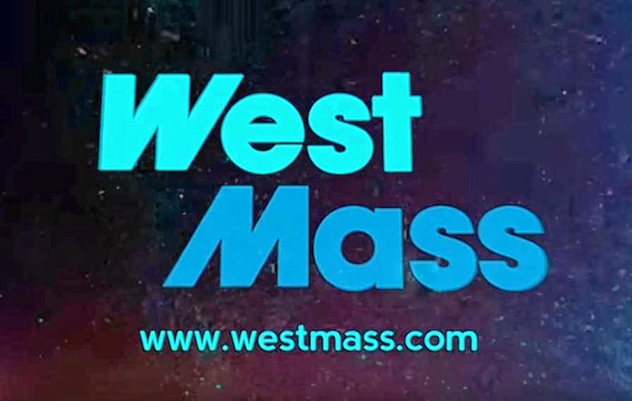
Early last month, the Greater Springfield Convention & Visitors Bureau and the Economic Development Council of Western Massachusetts announced a new brand identity: West Mass. The groups spent $80,000 on the campaign, hiring Oklahoma-based agency Cubic Creative to lead the re-branding of a region formerly known as the Pioneer Valley.
The reaction was swift and unforgiving. Springfield resident Dylan Pilon, whose online petition calling on officials to keep the name “Pioneer Valley” has gathered more than 1,000 signatures, told the Boston Globe in late February that “if they really thought this was going to be a game changer, then they fell flat on the execution.”
Online comments on news stories reporting the debut of “West Mass” range from tepid to irate. General consensus seems to find the new logo clunky and the new phrase hard to say. An altered version of the logo, which reads “Vast Mess,” made the rounds on social media. The launch video on YouTube has more than 44,000 views, but the top-voted comment reads: “It’s nice that even in these divisive times, we can all come together and agree that this is very bad.”
We have some larger questions. For one: the phrase “Western Mass” has long referred to Hampden, Hampshire, Franklin, and Berkshire counties, while “Pioneer Valley” refers only to the first three. The new brand co-opts the name of the former region, but the EDC and the Bureau only represent the counties in the latter region. We expect that Berkshire residents will be confused.
But we need to stop and talk about the two-minute launch video. Because we have some questions:
■ Why does the introductory animation look like a local TV news station’s attempt to riff on NBC’s “The More You Know” campaign? And why do we hear a 1983 Casio keyboard in the background?
■ Why is this edited like a Paul Greengrass film on Adderall?
■ Why do the quotations disappear so quickly? And why is there no mention of what people like Kim Gordon and Robert Frost have in common? (Answer: these people are all from the Valley)
■ Why flash a logo for Hasbro, which is based in Rhode Island, not Massachusetts?
■ Why are all the black people in the video either musicians or basketball players? Why is Michael Jordan, who doesn’t live in the region, featured so prominently?
■ In the quotation from the Robert Frost poem “The Road Not Taken,” why alter Frost’s text by cutting a word and removing a line break, ruining the meter of the verse? And why not check how Frost spelled the word “traveled”?
■ “Modesty” is touted as a regional trait. What does that mean?
■ Why is the video set to the kind of cheesy electro-beat that a clown would play off a boombox at a children’s birthday party at a roller rink? And why, given the miracle of Autotune, is it less catchy than virtually all other Autotuned videos on the internet?
■ Why are there so many slogans? Which is the real one? The website lists “The Land of Firsts.” Others from the video include: “Region of Firsts” and “Find Your First,” and the phrase “Modern Mavericks” appears four times.
■ Why choose to say the land has “fertility,” rather than simply that it’s “fertile”?
■ Why show the D’Amour Museum of Fine Arts twice with different overlays, as if it’s two different places?
■ Do we really need to see the same footage of the sack slide at the Eastern States Expo so many times? (Don’t get us started on the number of shots of the Basketball Hall of Fame.)
■ Are we supposed to know what the phrase “stake in the ground” refers to?
■ In the quotation “Why fit in when you were born to stand out,” why bother to leave off the question mark?
■ Did the shortened logo really have to resemble the Waste Management logo so closely?
■ Did it really need to cost $80,000 and take 11 months to decide to take the letters “-ern” off the existing name?
■ And, most importantly: couldn’t we have paid someone closer to home than Oklahoma to have an idea this bad?
Share your thoughts with editor@valleyadvocate.com.
