In “The Chemical Wedding,” local talent melds 400-year-old text with modern illustrations
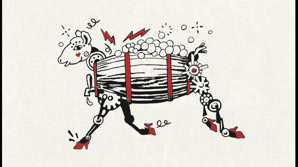
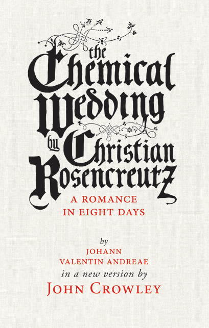
If the long book title, inked in faux-medieval Blackletter, didn’t give it away — let alone the robotic sheep on the back cover — The Chemical Wedding is one of the weirdest and most captivating novels to come out of Easthampton’s Small Beer Press this season.
Gavin Grant, who founded the press in 2000 with the novelist (and his wife) Kelly Link, calls it “one of the most beautiful and unexpected books we’ve ever come across.” And indeed, it’s a rare artifact: a German-language adventure story published in 1616 that seems to be an allegorical tribute to other alchemy-themed books of the time. It also appears to be a parody of those texts, which were often written as cryptic, rambling accounts of quests through dreamscapes ornamented with quasi-political and religious imagery.
“The Chemical Wedding is the story of a man invited to a wedding,” according to Small Beer Press. “From there, things begin to get very strange.” That’s putting it mildly. Take the early bits of Dante’s Inferno (before things really go to hell), stir in a heaping dose of Alice in Wonderland, pass it off to Stanley Kubrick, and you’d end up with something like this: a ridiculous and strangely funny picaresque in which the meek inherit, the mighty fall (sort of), cosmic forces manifest, and the surreal is completely, rudely real.
It initially caught the attention of John Crowley, the celebrated fantasy and science fiction novelist who lives in Conway, while he was researching the 16th and 17th centuries for a previous project. Crowley calls The Chemical Wedding “the first science fiction novel.” And while that honor is often afforded to Mary Shelley’s 1818 novel Frankenstein, Crowley’s argument is solid: “It’s fiction; it’s about the possibilities of a science; and it’s a novel.” Fair enough.
Crowley pitched a modernized version of an old English translation— with words and syntax revamped for today’s readers — to Small Beer Press, which raised over $70,000 on Kickstarter earlier this year to bring the project to life, including in limited-edition hardcover. Small Beer Press plans to publish The Chemical Wedding in trade paperback and e-book editions this fall, Grant explained on Kickstarter, but “we could not resist the chance to make a weird and beautiful artifact out of John Crowley’s long-dreamed-of project, with the help of some of our favorite artists and designers.”
That’s where illustrator Theo Fadel and book designer Jacob McMurray came into the picture. Building on Crowley’s vision, Fadel and McMurray gave The Chemical Wedding the special details it deserved: a beautifully clean layout, punchy footnotes laid down in red ink, and lush, humorous drawings.
“I knew that the text couldn’t just be left on its own,” Crowley says. “People need to have some clue as to what the heck is going on — what the book’s ambitions are.” Crowley supplied an introduction and some footnotes, annotating references to the alchemical processes he could recognize. “But I always knew I wanted to illustrate it too, in some surprising way,” he says. “Not just fantasy illustrations, or fake-old illustrations. It needed something new — something as weird as the text itself.”
What that might be, exactly, wasn’t clear until Crowley happened to swing through an open studio day on Cottage Street in Easthampton and chatted with Holyoke visual artist and sculptor Theo Fadel, whose work he promptly fell in love with.
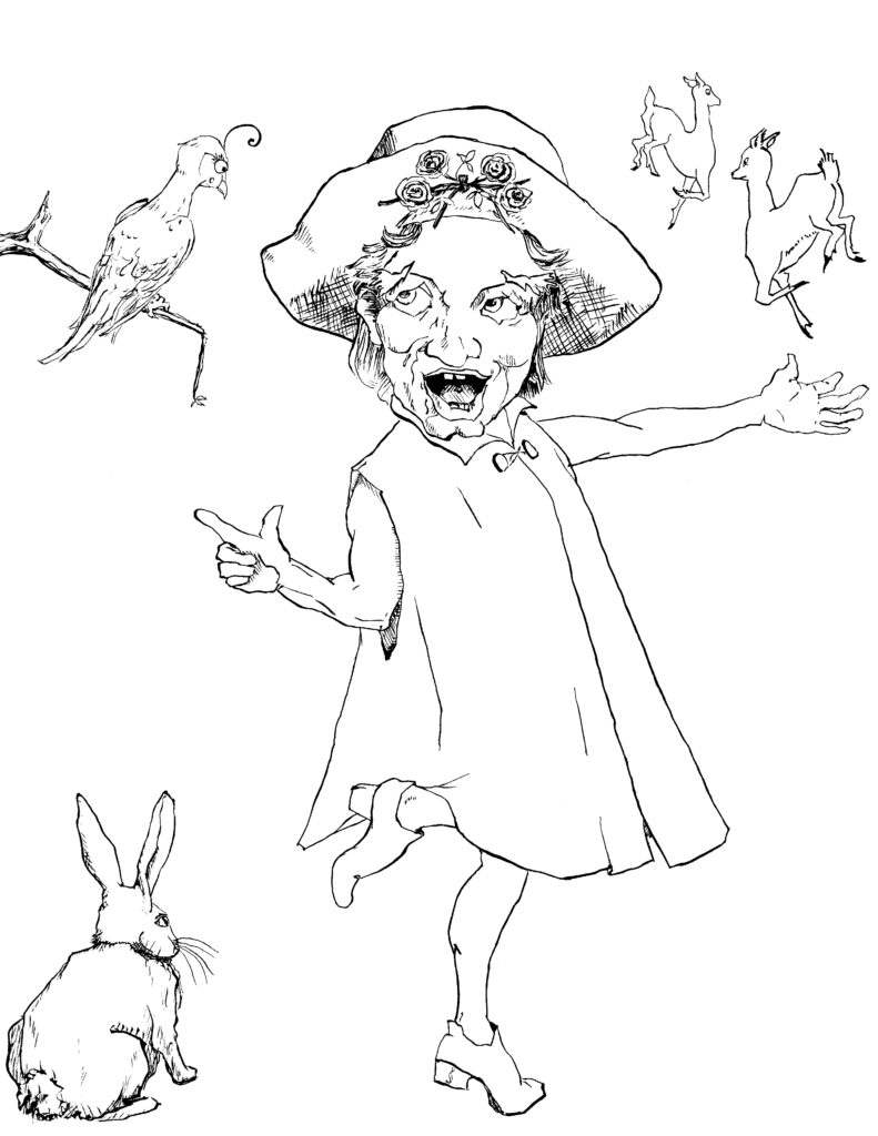
“The pictures she has done are, in some ways, more wacky and parodistic than are supported by the text,” Crowley says. “But they’re exactly right. They resemble the kind of satiric, grotesque woodcut art that was being made at the time when The Chemical Wedding was written. They’re almost like political cartoons. I think they’re perfect.”
Fadel says she tried to cultivate that spanning of time in her pen drawings (the collectible hardcover editions include a hand-printed woodcut by Fadel as well). “I wanted to illustrate my own experience of reading it now, rather than a historical take,” she says. “I was struck by this big emotional landscape — all of these ups and downs this poor little man goes through. I made myself a soundtrack, to try and follow that emotional landscape” (readers can get a taste of Fadel’s irreverent tone by putting on some Herb Alpert & the Tijuana Brass).
Certain drawings reached completion first, but Fadel worked on them simultaneously, and considers them as a series, “like the movie that happened in my head.” Although this is Fadel’s first book illustration project, she quickly discovered the space to add her personal flair and clever little anachronisms (the reclining Venus, for example, is pictured in hair curlers). “We all imagine what’s not mentioned, and I love to include those things too,” she says. “This text is a great satire, but also has great pockets of wisdom. I wanted it to be visually unexpected as well.”
With Fadel’s illustrations folded in, Grant took the manuscript to Jacob McMurray, a friend and graphic artist who works as the senior curator of the EMP Museum in Seattle. McMurray’s task: to make sure Crowley’s text and Fadel’s art play off each other in a clean, coherent way.
“There’s so much personality in the book itself, and then we have John and Theo’s personalities,” McMurray says. “My role was to kind of get out of the way.” Ultimately, he took on the front cover design, the interplay of red footnotes with black text, and the need to “amp up that alchemical mysticism” by sprinkling small illustrations — sun, roses, and mysterious symbols pulled from archival texts — throughout the book.
In a digital age when anyone can lay out a book — and book design can suffer gravely as a result — “there’s something magical about having a physical object in front of you that feels really balanced,” McMurray says. “How the text is set on the page, the page itself, the feel of the paper, the colors and margins… how that all works together is a nebulous, aesthetic process.”
Some flourishes, like that stark red text, demand attention, but McMurray has added other little nods to the work that the reader may not see. He has used Garamond Pro, for example — a typeface that would have been popular in Europe in 1616.
The end result, he says, is “mysterious, formal, serious, silly, and really absurd.” It’s a testament to the enduring power of truly weird and creative writing — and to how small tweaks to a visual recipe can conjure a whole new feast for the senses. Bookworms: dig in.
Contact Hunter Styles at hstyles@valleyadvocate.com.


