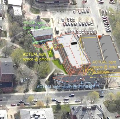
Well its nice to see on the Planning web page some added rendering of the
Hotel site plan trying to show us all better what is possibly going to
happen around it.
(Right click on the photo above and then click on "save picture as." Once saved on your computer you can then enlarge the photo for a better view. dgl)
In the aerial photo I have added some clarifications by taking the
proportions of the Hotel in Isometric, which is a parallel computer line
drawing with no vanishing points overlaid very inaccurately on the aerial
photo Perspective. They show the hotel massing quite a bit less than
actually is planned for creating much larger spaces between buildings.
This new Hotel rendering’s clear errors could be accidental but maybe not in
order to reduce the visual impact of the potential damages to the economic
vitality of their neighbor’s Historic buildings. The garage also seems oddly
out of its proper location to the hotel at the rear very tight 3-foot set
back between them. That error coincidentally also shows more space at the
apartment building.
This hotel/garage error also happens differently in the third dimension
vertically but still remains on the elevation drawings since the beginning
of their presentations. Here they falsely show the south west corner of the
hotel at the garage which is only 3 feet away on the West elevation of SK-6.
The drawing shows the garage falsely looking much lower than the hotel. Not
so in site planned and proposed reality. The grade lines of each building in
the West elevation are in "one drawing" and so should be set at the same
grade elevation just like the site plans show they are. This big error
seemed so bad as to be most likely just a cut and paste over sight, but to
have that garage elevation error again as the only place the garage shows up
in these new elevations, leads me to think its intentionally left to be
misleading.
In the "bus detailed render" from old south street we see a very ugly [to
me] high blank hotel wall’s ‘main entrance!’ next to the ‘mutant windows’
garage. "Welcome to paradise"!
There also is shown a much wider space at the old round house office
building than actually is planned for. The flat blanked out historic brick
wall is shown up to 30% higher than actual comparing to the hotel and has no
roof slope shown making me think the height they show is to the center
ridge, not the low office windowed wall cramped up to the hotel 13 feet
away.
On the renderings from New South St we see a small dark slit at the blanked
out apartment building corner, that’s the beginning of a 20 ft deep hole 12
feet wide at top to 16ft wide at bottom where over 70feet of hotel towers
that tight space. It widens to 22ft beyond mid apartment bldg. Then the
garage is 29ft away and parallel for way beyond that old building’s foot
print.
This to me professionally is not a worthy attempt at trying to show us
realty, and if its the best they can do then maybe it would match most all
of the other "far less than a paradise deserves" design work that we’ve seen
on that site.
Regardless we will live with what is built there until better renovations by
demolition occur in the future when a much better city government would
propose design competitions that fully illustrate to all of us what we are
forcing in ourselves. We know when mistakes get built they remain for a long
time due to the economics and then also they might get used as
justifications for more bad design work since its existing and therefore
absurdly ok. No way, for anything anywhere near called a paradise!
These photo/drawing clarifications follow up on previously submitted
drawings promised to the planning board on the hotel’s lack of drawings to
show them the cross sectional very close and tight proportions. We now know
they obviously did not have a concern about forcing this on others or they
would have requested better.
These sectional 3-D issues may remain unstudied and unseen, but when their
life size model is built in reality, we will then see this shady project
with its high tight spaces they propose. That is, only if the court system
doesn’t motivate a better plan for all in all the time it stands in this
paradise.
Tris Metcalfe
To view the developer’s revised renderings visit http://www.northamptonma.gov/opd

