Climate change is a worldwide problem, and we often hear of how it is affecting low-lying countries in Asia and the melting polar ice caps, but local climate data shows us how things are changing right here in the Pioneer Valley.
And changing they are.
The National Centers for Environmental Information, run by the National Oceanographic and Atmospheric Association, collects station data all over the world, and has for more than 100 years. We decided to take a look at the Amherst station, which is located at the wastewater treatment plant at the University of Massachusetts Amherst. The data there goes back to January 1, 1893.
Mysteriously, there was no data for the entire year of 1896, so for continuity’s sake, we began our look with the 1897 data.
The people recording took down the maximum temperature, minimum temperature, precipitation level, and snowfall every day for more than 120 years.
Climate data is full of messy noise. The highest temperature recorded was on July 4, 1911, when the thermometer reached 104 degrees. The lowest was on January 22, 1961, at a chilly 30 degrees below zero.
Is it significant that the highest temperature was recorded more than 100 years ago? Does that debunk the idea that our climate is getting warmer? No. Not when you look at the trends in the data as a whole.
Looking over the 120 years of data, lots of ups and downs take place. In Amherst, daily high temperatures mostly range from 10 to 100 degrees over the course of a year, and lows tend to be between -20 at the low end to 80 on the high end.
This daily data gives us useful tidbits, like what the average temperature is on each day of the year (which came in handy when we had to plug in a few hundred missing data points out of the 90,000 entries), but it is harder to see the trend of climate change that the scientific community has near unanimous agreement on. For that, we must zoom out a bit.
Looking at yearly averages, the picture does get a bit clearer. There are more years from the first half of the 20th century that are cooler and more recent years that are warmer, but what you get is still a jumble of years. Higher precipitation totals and more erratic snowfall totals emerge when looking at the yearly total. On so many days, there is no snow or rain, so a daily average is less useful than an annual one.
But where things really become obvious is when you zoom out even further.
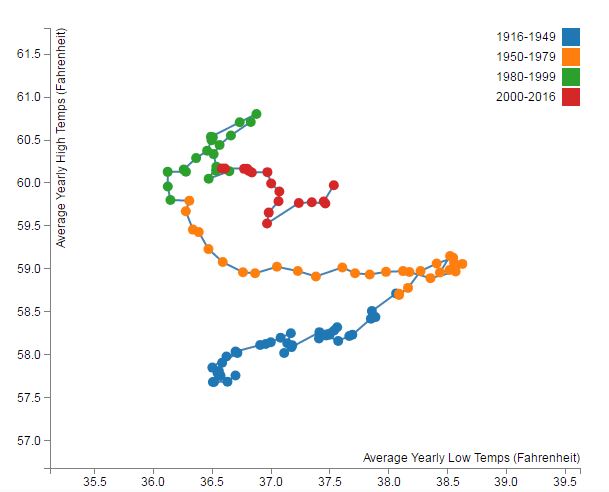
Climate change rears its ugly head when averaging multiple years rather than one at a time. At the National Weather Service and the National Centers for Environmental Information, meteorologists look at data by averaging 10 years and 30 years at once, according to Alan Dunham of the NWS and Scott Stephens of the NCEI. We decided to take 20-year averages, and look at them on a rolling basis (i.e. 1981-2000, then 1982-2001, then 1983-2002, etc …). A clear pattern emerged.
[d3-source canvas=”wpd3-36646-0″]
Older ranges nearly all have cooler highs than the newer ones, and the low temperatures seem to be swinging back and forth. The 20-year ranges ending before 1950 nearly all have average high temperatures below 58.5 degrees. Those from 1950 to 1980 are all between 58.5 and 60. And nearly all of the ranges since then have been between 59.5 and 61 degrees. The later it gets, the hotter it gets.
Precipitation, too, emerges as a major change. The 20-year averages show a steady climb of rainfall from normal averages previously around 42 or 43 inches per year climbing up to 46- and 47-inch averages. That’s even with the drought the region experienced in 2016 (about 32 inches of rain for the year).
Climate change is real, folks. You can see it from data collected in your own community.
Dave Eisenstadter can be reached at deisen@valleyadvocate.com.